JonHaines.com Website Redesign – Case Study
Introduction
Jon Haines, a certified cybersecurity professional and avid philosophy writer, approached us for a comprehensive redesign of his personal website, jonhaines.com. His site serves dual purposes – showcasing his cybersecurity consulting services and hosting his philosophy blog – and it needed to make a stronger professional impression. The existing site was built with Elementor and had begun to show its limitations in visual polish, speed, and mobile usability. Our mission was to rebuild the site on WordPress using the Flatsome theme (a modern, open-source alternative to heavy page builders). We set out to elevate the site’s aesthetics and performance while preserving all of Jon’s content and the distinct focus of each section (cybersecurity and philosophy). The end goal: a fast, visually engaging, mobile-friendly site with cohesive branding across both sections and a streamlined user experience for both Jon and his visitors.
The Challenge
Despite the valuable content Jon had developed, the old website was holding back his online presence. We identified several key challenges that needed to be addressed in the redesign:
-
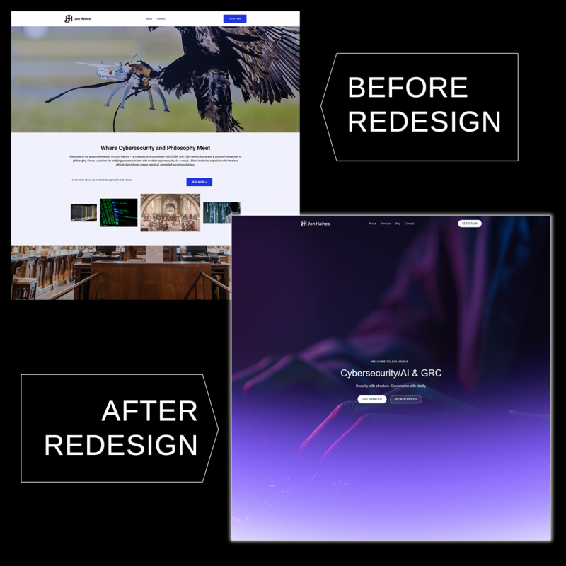
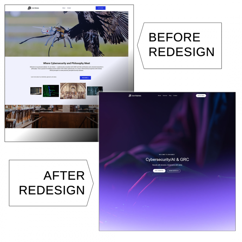
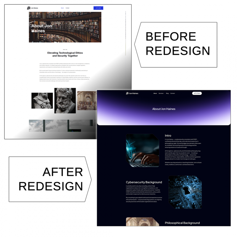
Outdated “Template” Look: The previous design looked generic and “cheap,” undermining Jon’s credibility. It lacked custom touches and professional typography, giving the impression of a stock template.
-
Inconsistent Branding: Jon’s site is essentially split into two sections – cybersecurity and philosophy – but the branding and design between them weren’t consistent. We needed a unified design language that still allowed each specialty to have its own identity.
-
Slow Performance: The Elementor-based setup, along with accumulated plugins and bloated code, made the site sluggish. Pages took too long to load, potentially driving away visitors. Jon was also on a standard Bluehost plan, which compounded performance issues. We knew that migrating away from the heavy page builder and optimizing the site would be critical for speed.
-
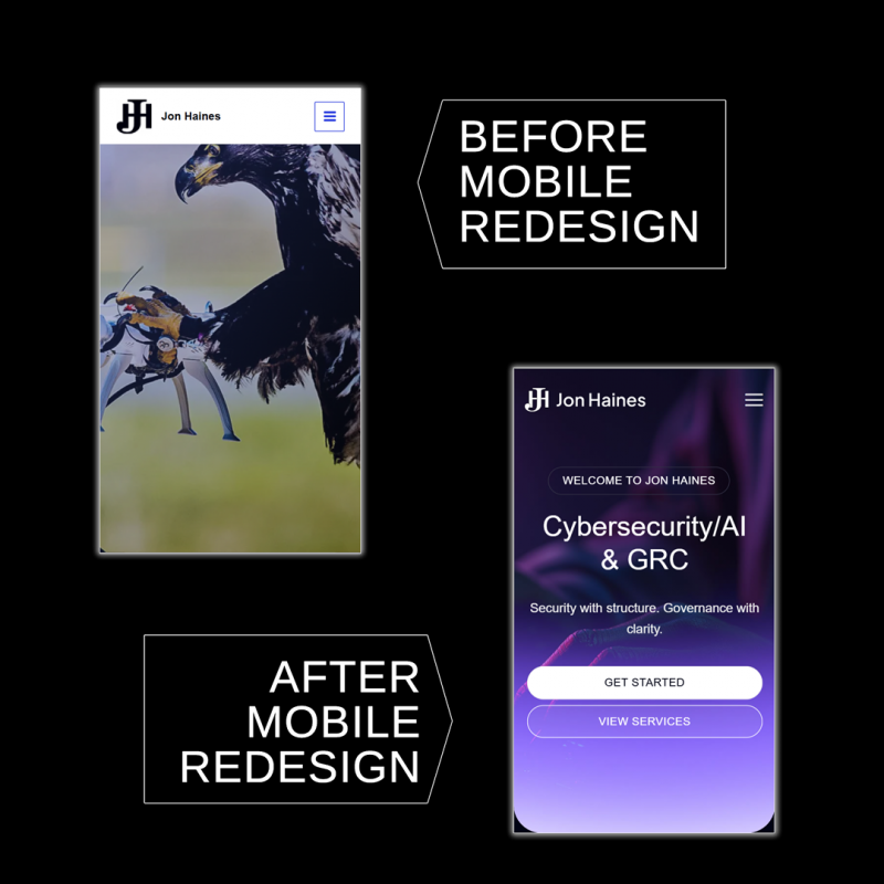
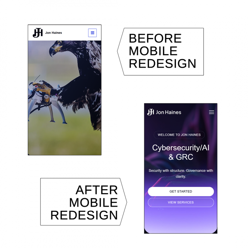
Poor Mobile Responsiveness: The site wasn’t fully optimized for mobile devices. Some layouts didn’t translate well to smaller screens, meaning mobile users had a subpar experience. In an era where many first impressions happen on phones, the redesign had to be mobile-first.
-
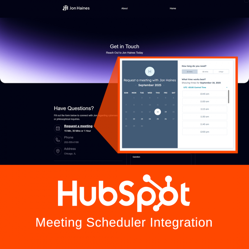
Suboptimal User Engagement: The old site had usability issues that could frustrate visitors. Jon wanted a more effective call to action – specifically, integration of his HubSpot meeting scheduler for easy bookings.
-
Maintenance Difficulties: Behind the scenes, managing content was harder than it needed to be. The Elementor editor, while powerful, was overkill for Jon’s needs and introduced complexity. The WordPress backend had clutter from prior iterations (e.g. unnecessary plugins, old page builder artifacts), which made self-edits and updates daunting for Jon. He needed a cleaner, more user-friendly backend so he could make updates himself without fear of “breaking” the site. We also saw an opportunity to lay better groundwork for SEO (search engine optimization) and analytics, which weren’t fully utilized on the old site, to help Jon’s site be more visible to potential clients in search results.
The Solution
We tackled these challenges with a ground-up redesign, acting as both web designer and developer to revamp Jon’s online presence. Our approach centered on using WordPress with the Flatsome theme as a foundation for a fast and flexible site. Here’s how we solved each issue and improved the site’s design and functionality:
-
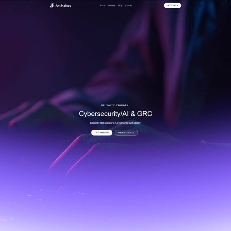
Fresh, Custom Design with Flatsome: We rebuilt the entire site using the Flatsome theme, migrating away from Elementor entirely. This instantly gave us a cleaner codebase and more performance-friendly framework. The new design shed the “cookie-cutter” feel by incorporating custom graphics and a modern layout tailored to Jon’s content. We refined the typography (e.g. slightly larger fonts for readability, per Jon’s request to accommodate older audiences) and introduced a more sophisticated color palette and styling. The result is a polished look that immediately conveys professionalism and credibility, in line with Jon’s expertise.
-
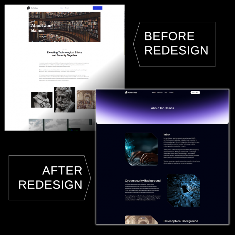
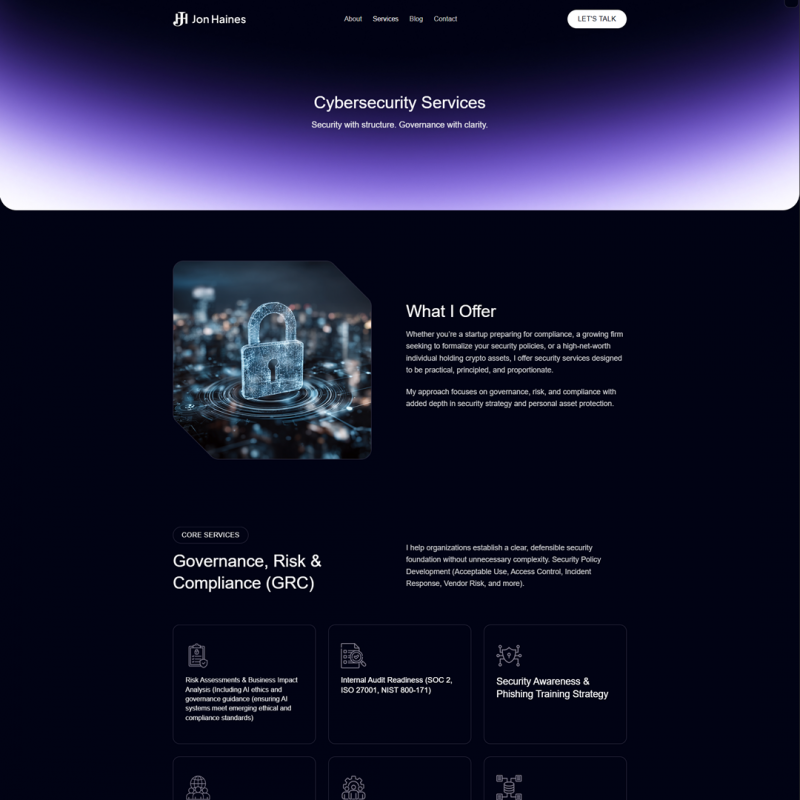
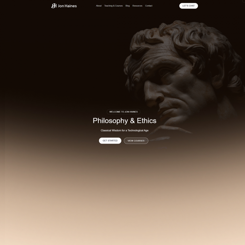
Cohesive Branding Across Sections: Using a single theme for both the cybersecurity and philosophy sections allowed us to enforce a consistent branding and navigation structure. We designed a universal header and footer for the site, so whether a visitor is reading about cyber risk management or a philosophy essay, it feels like part of the same website. At the same time, we gave each section a bit of its own flavor: for example, the Philosophy section’s hero banner now features a tasteful image of a classical statue bust (a nod to philosophical heritage), while the Cybersecurity side uses a subtle tech-inspired background – creating balance and thematic identity for each. Fonts, color schemes, and graphics are harmonious site-wide. This design consistency reinforces Jon’s personal brand across all his content.
-
Performance Optimizations: Speed was a top priority. By dropping Elementor, we vastly reduced page load times (no more heavy page-builder scripts loading on every page). We also performed a thorough cleanup of the WordPress backend, removing redundant plugins and legacy code that were clogging the works. Images were optimized for web, and we implemented best practices like caching and compression to ensure the site is significantly faster and more efficient. During development we noticed Bluehost’s storage was nearly full, so we coordinated with Jon to clear out an old 4GB backup to ensure the new site deployment had room to breathe. The difference is immediately noticeable – pages that dragged before now load quickly, improving the experience for every user.
-
Mobile-Responsive Layout: We adopted a mobile-first approach in the redesign. The new site uses responsive design techniques to rearrange and resize elements beautifully on smaller screens. Testing across phones and tablets was part of our process to guarantee that text is readable and images/videos scale correctly. Whether a visitor is on a desktop, iPad, or smartphone, the site now looks and functions great on all devices. For instance, multi-column layouts gracefully collapse into single columns on mobile, and navigation is handled via a clean mobile menu. This ensures Jon’s message is accessible to clients on the go.
-
Enhanced Usability & Navigation: We made numerous UX improvements across the site. One of the first was updating all clickable “cards” and sections so that users can click anywhere (not just on small text links) to navigate – a simple change that makes a big difference in usability. We also restructured the navigation menu to be more intuitive. We added a top-level “Resources” section in the menu. On the Cybersecurity page, we introduced on-page “jump to section” links for key service categories (like GRC, Crypto, Templates) so that visitors can quickly hop to the content most relevant to them. We also cleaned up redundant or outdated content. All these tweaks collectively make browsing the site simpler and more engaging.
-
Stronger Calls to Action: To help convert visitors into clients, we implemented the contact improvements Jon requested. We removed the plain email address from the Contact page and anywhere it was publicly visible (reducing spam risk). In its place, we integrated Jon’s HubSpot “Book a Meeting” scheduler across the site, including a prominent call-to-action button in the navigation and on relevant pages. Now, when a potential client is interested, they can instantly schedule a meeting with Jon through an embedded calendar, rather than sending a cold email. We made this CTA stand out visually (at one point, adjusting the styling to be bold and underlined so it wouldn’t be missed). We also ensured every page – whether on the cybersecurity or philosophy side – provides a clear next step for contact, either via the HubSpot scheduler or a short contact form. By standardizing these contact paths and highlighting the “Book a Meeting” option, the site actively invites engagement.
-
Simplified Backend & Training: Knowing that Jon wanted to manage his site content independently, we focused on making the backend as user-friendly as possible. We built the pages with Flatsome’s intuitive UX Builder, which offers a GUI-based editing experience – no coding required. We pruned unnecessary plugins and scripts, so the WordPress dashboard is now clean and straightforward. To empower Jon, we provided custom training materials: we recorded a set of training videos walking him through common tasks (updating text, swapping images, adding blog posts, etc.). We also included a one-hour live training session as part of the project, where we guided Jon through using his new site’s editor. By project handoff, Jon was comfortable making edits and knew that the new design would stay intact thanks to the structured theme. This knowledge transfer was important to ensure he gets long-term value from the redesign.
-
SEO Foundations and Future Growth: Beyond the immediate design and functionality, we set up the site for long-term success. We installed Google Analytics and configured basic SEO settings (like search-friendly URLs and metadata). We also did some initial keyword research and a competitor glance, folding those insights into the content structure – for example, emphasizing “Chicago” and local area mentions where appropriate, since Jon is based in the Chicago area. The new site is built as a WordPress Multisite (one for cybersecurity, one for philosophy under the same umbrella) to accommodate the two distinct sections without complicating management. This gives Jon the flexibility to later expand the site – for instance, spinning off a dedicated consulting microsite or adding new sections – without a rebuild. In short, the redesign isn’t just a one-time facelift; it’s a durable platform that can grow with Jon’s goals, whether he remains a solo consultant or builds a larger brand around his work.
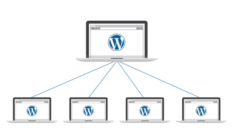
We set up WordPress Multisite so that instead of running everything under a single WordPress installation, we could split the project into two distinct sites that live within the same network:
-
Cybersecurity site – focused on the consulting and business services side. This has its own theme settings, plugins, menus, and content, tailored to the professional/technical audience.
-
Philosophy site – a separate site under the same network, but with its own look, layout, and content strategy. This allows it to feel more personal and exploratory, without interfering with the business side.
With Multisite, both sites:
-
Share one WordPress installation (so updates, hosting, and management are centralized).
-
Still act independently (each can have its own domain or subdomain, themes, and content).
-
Keep content, users, and branding separate, which prevents the two very different audiences (business vs. philosophy readers) from overlapping or getting confused.
This setup gives you the flexibility of two websites with the efficiency of one system to manage.
The Results
The transformation of jonhaines.com has been striking. The project achieved all its core objectives, significantly improving the site’s visual appeal, speed, responsiveness, and usability. Here are some of the most impactful results of the redesign:
-
Polished Visuals & Cohesive Branding: The website now presents a modern, professional face to visitors. Gone is the generic template look – replaced by a clean, custom design that reflects Jon’s personality and expertise. Both the Cybersecurity and Philosophy sections feel like parts of the same brand family, using consistent layouts, color schemes, and typography for a unified identity. Yet each section still speaks to its audience with relevant imagery and content focus, striking the right balance. This cohesive branding boosts Jon’s credibility in the eyes of his audience.
-
Improved Speed & Performance: By eliminating bulky page builder code and optimizing assets, we dramatically sped up the site’s performance. Visitors no longer have to wait on slow-loading pages – the site feels snappy and responsive. While we haven’t included specific speed metrics here, the qualitative improvement is clear. The streamlined codebase and reduced server load mean the site can handle traffic more efficiently, and it’s less likely to frustrate users with delays. This performance boost was achieved despite the previous hosting limitations (we worked within Jon’s existing Bluehost environment), proving that smart development choices can overcome infrastructure constraints.
-
Mobile-First User Experience: The new design is fully responsive, providing a first-class experience on smartphones and tablets. Mobile visitors can navigate the site effortlessly – menus are easy to tap, text is readable without zooming, and layouts adapt perfectly to smaller screens. This is a huge improvement over the old site. Now, whether a CEO is looking up Jon’s services on an iPhone or a student is reading his blog on an Android tablet, they’ll encounter a site that’s tailored to their device. A better mobile experience means visitors are more likely to stay and engage with the content.
-
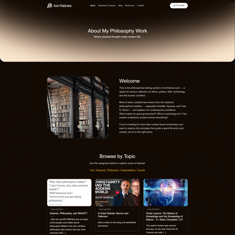
Enhanced Usability & Engagement: Usability improvements have made the site much more engaging and easy to use. Navigation is intuitive, with clear paths to find Services, Blog, Resources, and Contact pages. The addition of the Resources section and internal links helps surface more of Jon’s content to readers (for instance, philosophy readers can easily discover his cybersecurity offerings and vice versa). Interactive elements are now user-friendly – for example, each service “box” on the Services page is fully clickable, which invites exploration rather than causing confusion. We also placed subtle prompts and introductions (like a short welcome message at the top of the blog) to guide new visitors. Overall, the site now has a logical flow: visitors can smoothly learn about Jon, delve into his writings, and understand his services without hitting dead-ends or perplexing UI issues.
-
Streamlined Contact & Conversions: Perhaps one of the most important outcomes is how the site now encourages interaction. The “Book a Meeting” call-to-action is prominently featured and impossible to miss, making it far more likely that a curious visitor will convert into a scheduled call. The contact page and footer have been cleaned up – only relevant information is displayed, and the risk of email spam is minimized by using the scheduling form instead of publishing an email address. Early feedback indicates that this change makes the site feel more interactive and professional, as visitors can immediately take action. From Jon’s perspective, the integration of HubSpot means his scheduling process is now automated and convenient. In addition, Jon finds the backend much easier to work with: he can create a new blog post or edit a service description on his own in minutes, whereas before he might have avoided making updates due to the convoluted page builder. This self-sufficiency is a long-term win, ensuring the site stays up-to-date.
Client Feedback
Jon’s reaction to the new website has been overwhelmingly positive. Throughout our collaboration, he provided feedback that affirmed we were hitting the mark. Here are a few of his comments, shared with permission:
“The updates look really great. We’re about 90% of the way there now… thanks for all the work you’ve put into this.”
“Really pleased with how this is shaping up. I’m excited to see it all come together.”
“I think everything looks great… Other than that, I think we’re ready to go live!”
In short, Jon was thrilled with the transformation. He especially loved the improved aesthetics – noting the faded statue graphic on the Philosophy page as a favorite touch – and appreciated the site’s new ease of use. By project’s end, he had the confidence to take the reins of his website. As he succinctly put it in our final review, everything was “looking great!”. It was gratifying for us to see our work not only meet but exceed the client’s expectations.
Conclusion
The jonhaines.com redesign project was a success on all fronts: the site now reflects the professionalism and unique dual expertise of Jon Haines, with a design that is visually engaging, fast, mobile-friendly, and easy to maintain. What started as a website with a “good enough” template has been transformed into a dynamic platform that will support Jon’s consulting business and personal brand for years to come. The project also laid a foundation for future growth – whether that means adding new content, integrating more features, or scaling up the site as Jon’s audience expands.
Does your website need a similar transformation? We specialize in turning outdated or underperforming sites into modern, effective platforms that elevate your brand. Whether you’re a consultant, a small business, or anyone with a web presence that isn’t living up to its potential, we’re here to help. Reach out to us for a conversation about your goals – let’s discuss how we can take your site from “okay” to outstanding. Your future clients are looking for you online: let’s make sure they love what they find.